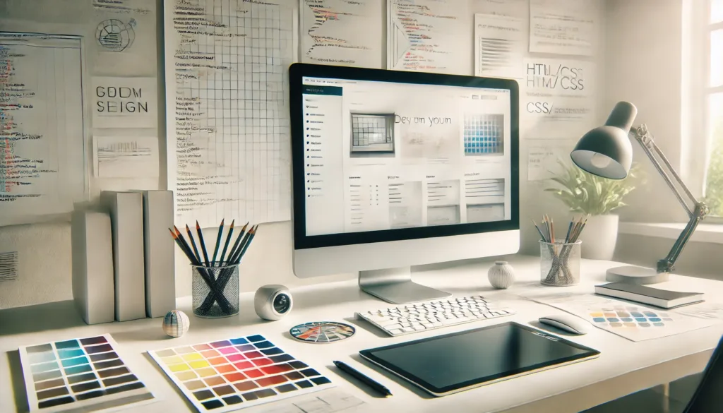
This post builds on insights from my earlier article, Best practices for mobile friendly Web design. After collaborating on several recent projects with graphic artists transitioning from print to digital, I’ve been reminded of a crucial principle: designing with the development in mind.
For web projects to succeed, designers must approach their work with an understanding of how their designs will be built. A beautiful mockup is just the beginning—true success comes when that vision translates seamlessly into a functional website. Here are three key areas to focus on when designing with the development in mind:
1. Scale and Framework Compatibility
Designs don’t exist in a vacuum—they’re developed within specific frameworks and constraints. One of the most important things a designer can do is match the dimensions and scale of the design to the framework it will be developed in.
For instance, if you’re designing for the Bootstrap Framework, it’s best to work within a 1200px grid (with a 1140px active area and 15px gutters). While full-width elements can add visual impact, remember that most screens won’t exceed 1200px in width—so design responsibly. It’s also critical to plan for responsiveness from the start, especially how your base layout will adapt to mobile browsers.
Designing with the development in mind means embracing the grid, understanding breakpoints, and ensuring your layout decisions can translate into code with minimal guesswork.
2. Font Choices and Typography Consistency
Let’s talk fonts—because they can make or break a design’s integrity when moving from mockup to code.
When designing with the development in mind, always stick to web-safe fonts or web fonts from trusted libraries like Google Fonts. Standard system fonts like Arial, Helvetica, or Verdana ensure compatibility across devices. Web fonts add more personality and variety, and when both the designer and developer use the same source, the result is pixel-perfect typography.
Just as important is designing in pixels—not points or percentages. This helps developers match font sizes exactly as you envisioned them. To ensure consistency throughout the site, create a simple style guide listing all font families, sizes, and colors. Tools like Styleguides or Frontify can make this process easier and more collaborative.
3. Visual Consistency in Headings and Layouts
Consistency is key—both for user experience and development efficiency.
HTML provides a built-in structure with heading tags (H1–H6), and sticking to a consistent visual style for each level simplifies development and improves readability. If your H1 looks completely different on one page versus another, it can confuse both users and developers.
That’s not to say you can’t change things up to emphasize key content. Just make sure variations are intentional and part of the overall design system. A consistent structure makes the site feel cohesive and ensures that changes are scalable and easy to maintain.
Final Thoughts
Designing with the development in mind is more than a best practice—it’s a mindset. It streamlines collaboration, reduces rework, and ensures the final product is as close as possible to the designer’s original vision.
By aligning your design process with the realities of development—through thoughtful scaling, smart font choices, and consistent styling—you empower developers to bring your ideas to life without compromise.
The smoother the handoff, the better the outcome. So, the next time you open your design software, remember: you’re not just designing for the screen, you’re designing for the code that makes it real.


