The Flexible Box Layout Module aka “Flexbox”, makes it easier to design flexible responsive layout structure without using float or positioning. Based on the article from W3 Schools, I provide some examples of how to use Flexbox.
With Flexbox, the outer layer is called a flex container with its display parameter set to “flex” in CSS. For example, we can define a class for this container called “flex-container”
.flex-container {
  display: flex;
}
We then add the divs inside called “flex items” or “children”. This allows you to move or arrange items in different ways within the container.
Some of the flex properties for these flex items are:
Flex Grow
Flex Grow allows Items to grow if needed. The other items or children will take up the space equally.
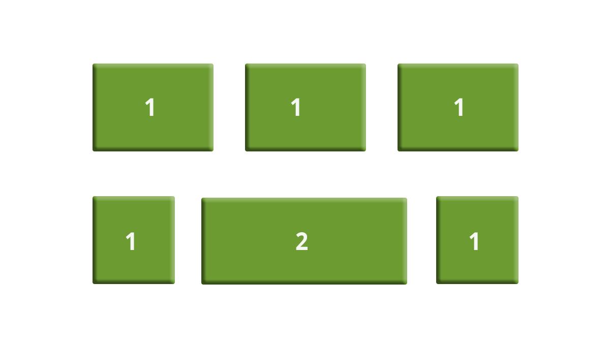
This defines the ability for a flex item to grow if necessary. It accepts a unitless value that serves as a proportion. It dictates what amount of the available space inside the flex container the item should take up.
If all items have flex-grow set to 1, the remaining space in the container will be distributed equally to all children. If one of the children has a value of 2, the remaining space would take up twice as much space as the others (or it will try to, at least).
.item {
  flex-grow: 4; /* take up 4 times the space as other children */
}
Flex Direction
Flex Direction helps to stack items vertically or horizontally from top to bottom, bottom top, right to left, or left to right.
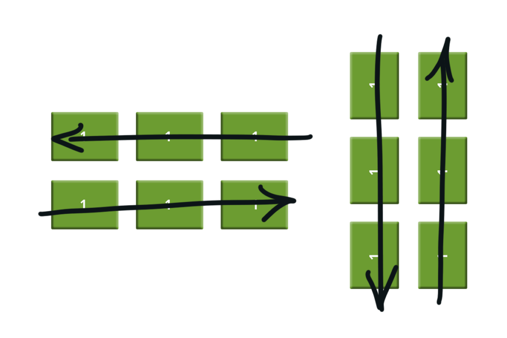
The column value stacks the flex items vertically (from top to bottom):
.flex-container {
  display: flex;
  flex-direction: column;
}
The column-reverse value stacks the flex items vertically (but from bottom to top):
.flex-container {
  display: flex;
  flex-direction: column-reverse;
}
The row value stacks the flex items horizontally (from left to right):
.flex-container {
  display: flex;
  flex-direction: row;
}
The row-reverse value stacks the flex items horizontally (but from right to left):
.flex-container {
  display: flex;
  flex-direction: row-reverse;
}
Flex Wrap
By default flex times align in one line. Flex wrap allows the items to wrap to another line.
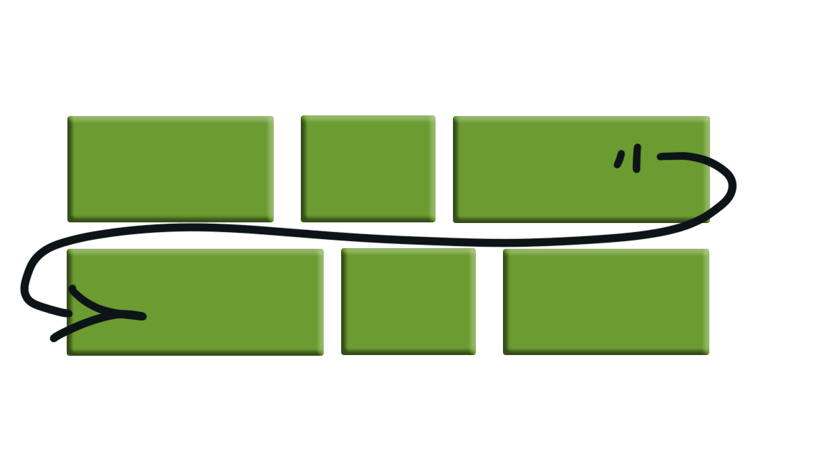
The wrap value specifies that the flex items will wrap if necessary:
.flex-container {
  display: flex;
  flex-wrap: wrap;
}
Justify Content
Distributes the leftover space equally between a number of items.
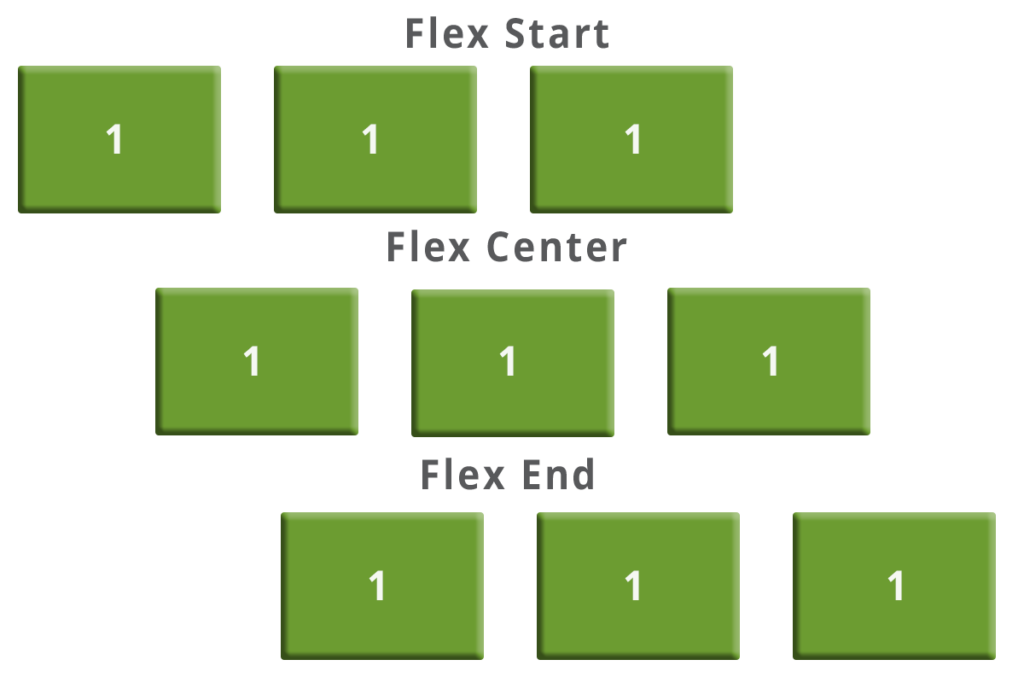
The center value aligns the flex items at the center of the container:
.flex-container {
  display: flex;
  justify-content: center;
}
The flex-start value aligns the flex items at the beginning of the container (this is default):
.flex-container {
  display: flex;
  justify-content: flex-start;
}
The flex-end value aligns the flex items at the end of the container:
.flex-container {
  display: flex;
  justify-content: flex-end;
}
If you are a traditional CSS/HTML developer like we are Flexbox is that voodoo magic. We see flex being used more and more. It addresses many of the positioning issues that we face in web development. This post is only a cursory look at some of our favorite flex properties, check out the resources below for more information.